
To draw bubble writing letters, start with light pencil sketches using rounded block forms. Inflate your letters by rounding corners, then outline them with a fine liner for bold edges. Add depth by shading one side based on your light source and highlight the top curves. Choose a color palette of 2 to 3 harmonious shades for a vibrant look. Keep practicing your spacing and proportions for consistent results. There’s so much more to explore in enhancing your bubble letters!
Key Takeaways
- Start with light pencil block letters as a base, ensuring even proportions and spacing for accurate bubble shapes.
- Round out sharp corners and edges to create the characteristic puffiness of bubble letters.
- Outline the letters with a fine liner or black marker, maintaining consistent thickness throughout.
- Use two to three colors for filling, considering color psychology to convey your intended message.
- Add highlights and shadows based on a light source to enhance depth and dimension in your design.
What’s Bubble Writing All About?
Bubble writing is like a burst of creativity on the page, bringing a playful twist to traditional lettering. This style, with its rounded, inflated letter shapes, captures attention and sparks joy. Originating in the 1970s from graffiti artist Phase 2, it showcases bold visual characteristics like smooth curves and thick outlines. Each letter resembles a floating bubble, creating a friendly and whimsical appearance. You’ll find bubble letters in greeting cards, school projects, and logos, where they invite connection and expression. Embrace this fun typography to make your text feel approachable, engaging, and uniquely yours. Bubble writing enhances creativity in personal and professional projects, making it a fantastic choice for those who appreciate high-pigmentation ink that can bring their designs to life. This playful approach not only allows for artistic expression but also fosters self-expression and emotional intelligence, as it encourages writers to explore their feelings through unique designs.
How to Sketch Bubble Letters
To start sketching bubble letters, gather your essentials: a sharp pencil, clean eraser, and smooth paper.
Begin by lightly outlining the basic letter shape, keeping it simple and thin, so your bubbly edges have room to breathe. With each stroke, imagine the letters puffing up like soft clouds, ready to pop with color and flair! The origin of bubble letters in graffiti art adds an exciting historical context to your creative process. As you progress, remember to create a base for further detailing to enhance the overall effect of your bubble letters. Incorporating cast shadows on one side of your letters can significantly add depth and dimension to your design.
Essential Materials Needed
Creating eye-catching bubble letters starts with the right materials, setting the stage for your artistic journey.
Begin by selecting paper that suits your style: smooth, heavyweight paper for clean lines, or marker paper to prevent bleed-through. A trusty pencil, preferably a mechanical one, will help you sketch those bubbly shapes. Additionally, using plain paper as a foundation allows for easy erasing and refining of your designs. Don’t forget your erasers—standard and kneaded ones are perfect for refining your design. For outlining, a fine liner or black marker adds that crisp finish. The choice of ink type can greatly enhance the visibility and vibrancy of your final letters. Choosing a gel pen with quick-drying ink will help you avoid smudging your designs.
Finally, consider colored pencils or markers for vibrant fills. Gathering these essential supplies will ensure you’re ready to let your creativity flow! Using a Pentel mechanical pencil allows for precise sketching, making your bubble letters more refined and enjoyable to create.
Basic Sketching Techniques
As you commence sketching bubble letters, start by imagining the playful shapes waiting to emerge from your pencil. Use simple block forms as your base, keeping the lines light for easy adjustments. Round out sharp corners, creating that signature puffiness. Ensure that you practice both uppercase and lowercase letters to build confidence in your bubble lettering skills.
To enhance your creative process, consider the importance of effective time management as it allows you to dedicate focused time to practice and refine your bubble writing. Guarantee consistent spacing between your skeleton and the outer outline—oval shapes work wonders here. Prioritize letter proportions, letting each character breathe while maintaining clarity. Use guidelines for alignment and flow, practicing with short words first. Additionally, remember that bubble letters are versatile for various applications, making them a fun addition to your artistic toolkit.
This sketching phase is your playground; refine those curves and erase as needed, preparing for your final, vibrant creation. Enjoy the process!
Mastering Bubble Lettering Outline Techniques

Mastering the art of bubble lettering outline techniques reveals a whole new dimension of creativity in your designs. Start with a simple skeleton, using light pencil block letters. Build a rounded outer outline, smoothing corners to achieve that signature bubble look. Control letter structure and spacing, ensuring even thickness. Clean up by erasing initial lines and inking the refined outline. Here’s a quick reference table for your outline refinement:
| Step | Action | Goal |
|---|---|---|
| Skeleton | Light pencil block letters | Clear base shape |
| Rounded Outline | Smooth curves, even spacing | Signature bubble effect |
| Final Touches | Erase and ink | Clean, readable letters |
| Quality Check | Review edges and spacing | Maintain uniformity |
Adding Depth With Shadows and Highlights
To bring your bubble letters to life, adding depth with shadows and highlights transforms flat shapes into vibrant, three-dimensional forms.
Start by identifying your light source; shadows should fall opposite this, enhancing depth perception. Use shadow techniques, like a second outline slightly offset from the letters, leaning diagonally for that 3D look. Utilizing archival quality ink ensures your shadows remain crisp and vibrant over time.
For highlight placement, add accents where the light hits, usually on upper curves. Employ a white pen for a glossy finish. Adding movement to your letters, much like how hair movement conveys emotion in character portrayal, can also enhance the visual appeal of your designs.
Combining these elements creates stunning dimensional effects, making your lettering pop off the page while ensuring readability and consistency across all letters.
Choosing Colors for Your Bubble Letters

When you’re picking colors for your bubble letters, think about the mood you want to convey. High-contrast pairings can make your letters pop, while harmonizing shades can enhance the overall theme. Mixing the right colors not only grabs attention but also brings your design to life! Additionally, consider using high-quality materials to elevate the overall appearance of your project. Utilizing vivid imagery in your color choices can further enhance the emotional impact of your design.
Color Psychology Insights
Choosing colors for your bubble letters can dramatically influence the vibe of your artwork, as each hue carries its own emotional weight. Warm colors like red and orange evoke playful tones and energy, perfect for informal designs. Meanwhile, cool colors such as blue and green create calmness and harmony, appealing to a more sophisticated audience. Writing, as a form of artistic expression, allows you to convey emotions through your color choices.
Remember, color meanings vary by context and culture; what feels lively in one setting may seem serious in another. For effective palette selection, aim for 2 to 3 colors, ensuring your combinations reflect the intended message while maintaining visual hierarchy and audience preferences. Additionally, employing creative narrative structures can enhance the appeal of your overall artwork and engage your audience more effectively.
Contrast for Visual Appeal
While you craft your bubble letters, contrast becomes your secret weapon for visual appeal. Use high-contrast fills and dark outlines to enhance readability; this keeps your letters distinct against the background.
Think about contrast dynamics—light centers paired with darker edges create depth, making your letters pop. Avoid similar-tone pairings that flatten your designs.
Opt for dark outlines on light fills, especially with busy backgrounds, to maintain visual hierarchy. A few well-placed accent colors, like white highlights, can add shine without overwhelming.
Keep it simple, and watch your bubble letters truly come alive with striking clarity!
Harmonizing With Theme
Building on the visual appeal created through contrast, harmonizing your color choices with the theme can elevate your bubble letters to new heights. Consider color symbolism and theme coherence for a cohesive design.
| Theme | Color Palette |
|---|---|
| Primary Classroom | Red, Yellow, Blue, Green |
| Candy Pastel | Pink, Mint, Lavender, Peach |
| Neon Graffiti | Lime, Cyan, Magenta, Orange |
| Mood Effects | Bright for cheerfulness, Cool for calm |
Using limited palettes and shade layering enhances readability and depth, ensuring your letters resonate with your intended message and audience.
Strategies for Consistency in Bubble Letter Design
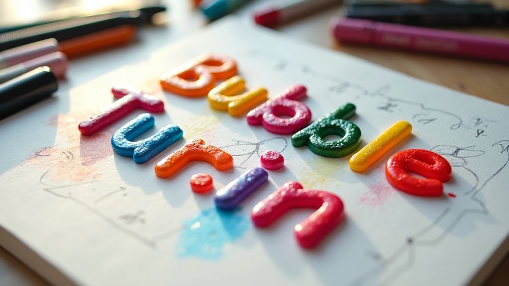
To achieve consistency in bubble letter design, you’ll want to focus on maintaining key elements that unite your letters into a cohesive whole.
Start with stable bubble letter proportions, ensuring uniform height and width for a balanced look. Use consistent outlines for clarity, and apply spacing techniques to keep letters evenly aligned.
Embrace style repetition by rounding curves and softening sharp corners across the board. For a polished finish, plan your highlight strategy and shadow placement, creating a harmonious visual flow.
Common Mistakes to Avoid in Bubble Lettering
When it comes to bubble lettering, avoiding common pitfalls can make all the difference in your design. Focus on letter size; starting too small leads to uneven shapes and cramped counters. Confirm counter clarity; overfilled interiors can turn letters into blobs, losing their identity. Maintain shadow consistency; mismatched shadows disrupt the 3D effect. Emphasize fill simplicity; busy patterns clutter your design, making it hard to read. Finally, remember text purpose—bubble letters shine in titles and short phrases, not lengthy paragraphs.
| Mistake | Solution |
|---|---|
| Starting too small | Increase letter size |
| Overfilled counters | Keep counters spacious |
| Inconsistent shadows | Match shadow direction |
| Busy patterns | Use simple fills |
| Using for body text | Limit to titles/phrases |
Practical Applications of Bubble Letters

Bubble letters bring a vibrant flair to various settings, making them a go-to choice for educators, students, and crafters alike.
You can harness their playful style in multiple ways:
- Classroom Displays: Use bubble letters for eye-catching posters and signs that engage student creativity.
- Event Signage: Create festive banners and invitations with bold bubble lettering for celebrations and gatherings.
- Craft Projects: Enhance scrapbooking or DIY crafts with colorful bubble letters, perfect for personalizing gifts.
Whether in digital art or branding applications, bubble letters add a unique touch that invites interaction and joy!